Most users decide how they feel about a website halfway through scrolling. If the experience doesn’t feel effortless, visitors abandon the site instantly. In the modern digital era, websites are often the first conversation between a brand and its audience, and first impressions online happen much faster than most websites finish loading. Before you even get a chance to communicate, sell, or connect, the website experience has already influenced whether visitors stay or leave.
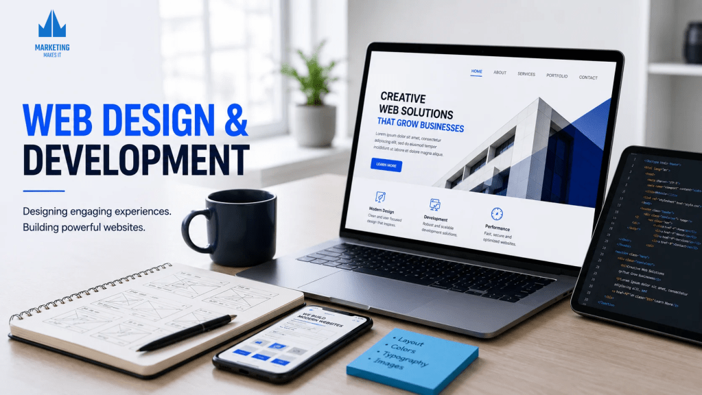
In the current digital landscape, web design and development are way more than just about pretty-looking websites. Users demand experience that feels effortless, one action leads to another, not those painfully slow, confusing websites that leave them frustrated and ready to leave. Modern web design and development are centred around crafting websites that feel effortless, intuitive, visually engaging, and easy to use across every device. From responsive layouts and fast loading pages to user-focused navigation and high-performance design, websites today are expected to do far more than just exist online. They need to capture attention instantly, guide users naturally and create an experience that people enjoy.
As digital behaviour will continue to evolve, audiences are going to become more demanding and selective about the websites they engage with. Businesses now need websites with a perfect balance of creativity and functionality because in an era shaped by user online behaviour, web experiences often determine the fate of your website. This blog will explore what makes a website feel worth people’s time, attention and engagement.
What Web Design and Development Mean Today
Ever experienced how some websites smoothly guide you towards the next step, while others make you mentally exhausted and frustrated to navigate? People no longer judge websites by just beautiful visuals, they want more from it, they expect the website to feel effortless, responsive and above all, fast when navigating through it. We now live in an era where people are deeply accustomed to fast-paced digital experiences, which means every small delay, poor navigation or slow loading speed can put off your audience within seconds.
Modern websites now focus on:
- User – first digital experiences: Website designs today are more focused on user behaviour, how they browse, interact and engage online.
- High-performance websites: Websites are expected to be more responsive, naturally guide users towards the next step and have a fast loading speed for seamless engagement.
- SEO friendly structure: Websites are being optimised for better search visibility and overall digital performance.
- Consistency across devices: Websites are built to serve the same experience across every screen size and platform.
- Conversion-focused websites: Website structures are built in a way that naturally guides users towards a specific action through their interactive and engaging interface.
- AI-powered websites: The highlight of modern web design is the rise of AI-driven sites that, through features like personalised recommendations, smart chat support, predictive search, and behaviour-based interactions, deliver a tailored experience for every user. Additionally, they help create faster and smarter websites, which are very much needed today.
The Anatomy of a Seamless Website
Good websites provide information, but the best ones know how to guide people so naturally without making navigation feel like an effort. Seamless websites are not accidental; they are crafted with intention around user psychology, browsing patterns, and an easy-to-interact interface, so users don’t have to spend time figuring things out, thus simplifying decision-making and making every action feel natural.
What Shapes a Seamless Website:
- Strategic visual flow: Important content and actions should be positioned strategically to grab attention and guide users naturally.
- Minimal friction: Reduce unnecessary popups, excessive form fields, confusing menus, and too many clicks that make browsing slow and exhausting.
- Smooth navigation: Users should be able to move through pages effortlessly with clear navigation, fast loading speed and a responsive browsing experience without feeling lost.
- Clear communication: The audience should be able to instantly comprehend what the website has to offer.
- Clean layout: Balanced spacing makes the website feel organised, readable and visually appealing.
- Responsive interface: Hover effects, transitions, subtle animations, smart search suggestions and instant chat support make websites feel more interactive.
- Visual design: Colours, typography, imagery and layout influence how users perceive and connect with a website.
- Strategic call to action: Actions and buttons should feel naturally placed along the browsing journey.
- Multi-device responsiveness: Website experience should feel consistent across every device and screen size, without broken layouts.
Web Design Vs Web Development
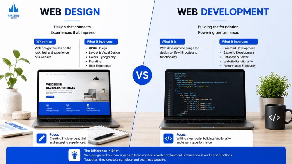
Web design and development are often used together; however, both serve different purposes in building a website. While web design focuses on how a website looks, feels and interacts with users. On the other hand, web development is about how a website functions, performs and works behind the scenes. Strategic amalgamation of both is what creates an unforgettable user journey.
What Web Design Offers:
- Website layouts and visuals structure: Organising sections, content, in a way that feels clear, balanced and easy to browse.
- Navigation and browsing set up: Designing menu bars, page flow that helps users move easily within the website.
- Typography, spacing and readability: Using fonts, spacing, and text to improve overall visual and reading experience.
- Visual hierarchy and layout balance: Using contrast, symmetry or intentional asymmetry to catch attention and improve visual appeal.
- Whitespace: Using empty space between sections such that it helps the website look cleaner and more organised.
- Visual emphasis: Font size, colours, and design elements are strategically used to highlight certain content and action.
- Interactive elements: Adding hover effects, animation and transitions to improve engagement.
- Search Engine Optimisation (SEO): Organising website layout, headings and sections in a way that improves search visibility.
- UX focused web design: Designing websites around user behaviour and usability, giving users a personalised experience for that instant connection.
What Web Development Offers:
- Website functionality and performance: Ensures websites function smoothly, load efficiently, and handle user interaction without technical issues
- Coding, programming and backend systems: Builds a technical foundation of a website that powers behind-the-scenes functions like managing databases, API’s, user authentication, payment methods, user interaction, and everything that operates behind the visual interface.
- Website speed and technical optimisation: Optimising code, media and website structure to improve loading speed and performance.
- Website structure: Managing the infrastructure, server, storage, hosting environment, and technical architecture that keep websites stable, secure, and functional.
- Website operations and interactions: Ensuring forms, buttons, navigation, payment systems and interactive elements function efficiently across devices.
- Technical SEO: Improves website speed, responsiveness, structure and overall performance to help the website rank better on search engines.
Adaptive Vs Responsive Design
Today, people access websites through a wide range of devices and screen sizes. Which means websites are expected to function efficiently everywhere. This is where adaptive and responsive web designs become an important part of the modern web experience.
Adaptive website design: Involves using separate layouts specifically created for different devices and screen sizes, so websites can offer a more optimised browsing experience on each device.
Responsive website design: Involves using flexible layouts that automatically adjust content, images and website structure in real time to fit different screen sizes and devices.
Popular Tools Used in Web Design and Development
Modern-day web design and development rely on various tools that help designers create better user experiences, and developers build functional and high-performing websites. While design tools focus on visuals, layouts and prototyping. Development tools focus on coding, functionality, performance and website management.
Web Design Tools:
- Figma: Widely used for UI/UX design, wireframing, prototyping and collaborative workflows.
- Adobe XD: Used for creating website layouts, prototypes and interactive user interface designs.
- Canva: Helpful for quick website graphics, visual assets, banners and social design elements.
- Adobe Photoshop: Used for image editing, website visuals and creative web design elements.
- Sketch: Popular for interface design, wireframes, and web design systems.
Web Development Tools:
- GitHub: Used for code storage, collaboration, version control and project management.
- Visual Studio Code: A popular code editor for website and application development.
- WordPress: Widely used for building and managing websites without extensive coding.
- Wix Studio: A web design and development platform used for creating professional no-code to low-code websites.
- React.js: Used for building dynamic, interactive website interfaces.
- Node.js: Helps developers build scalable backend systems and website functionality.
Because Great Websites Feel Effortless
People might not remember every little detail of a website, but what they will definitely remember is how easy or frustrating the experience felt. A great user experience is cultivated through websites that feel natural in the way they guide users towards the next step, communicate clearly and above all, provide a tailored experience in the era shaped by personalised digital interactions.
Users now expect websites that feel fast, effortless, accessible and easy to engage with across every device and screen size. This is why modern web experiences should strike a balance between thoughtful web design, strong development, responsive functionality and UI – focused experience.
Because in the end, seamless interaction is what people are going to remember and keep coming back to.
 Marketing Makes It
Leave a comment